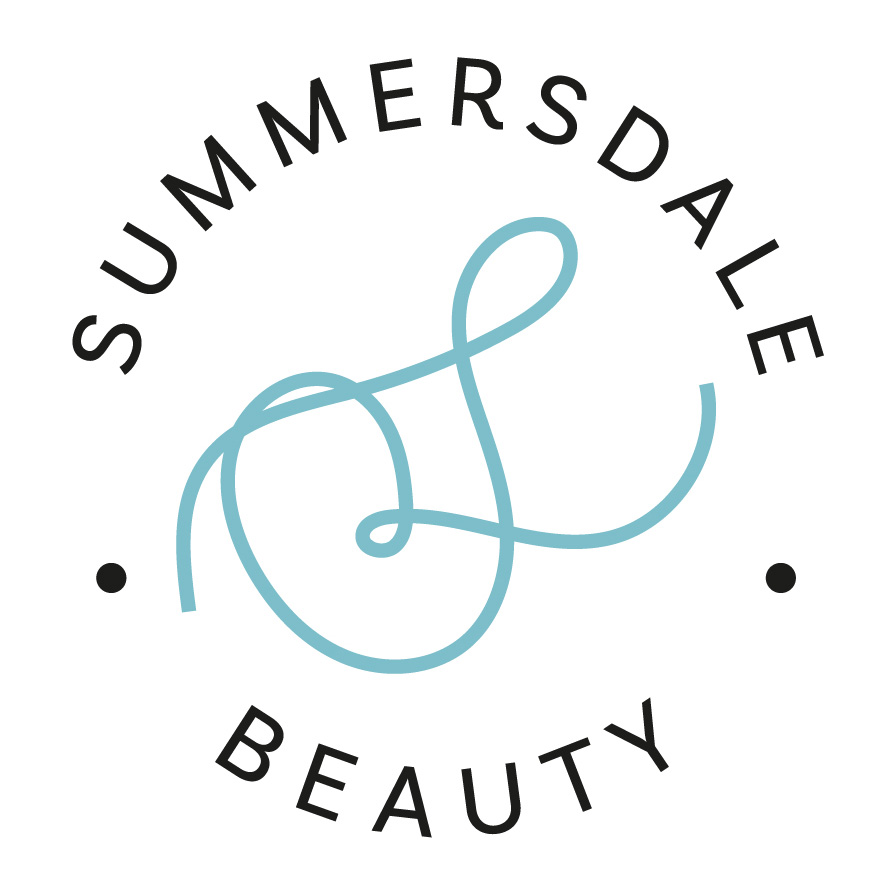
SUMMERSDALE BEAUTY
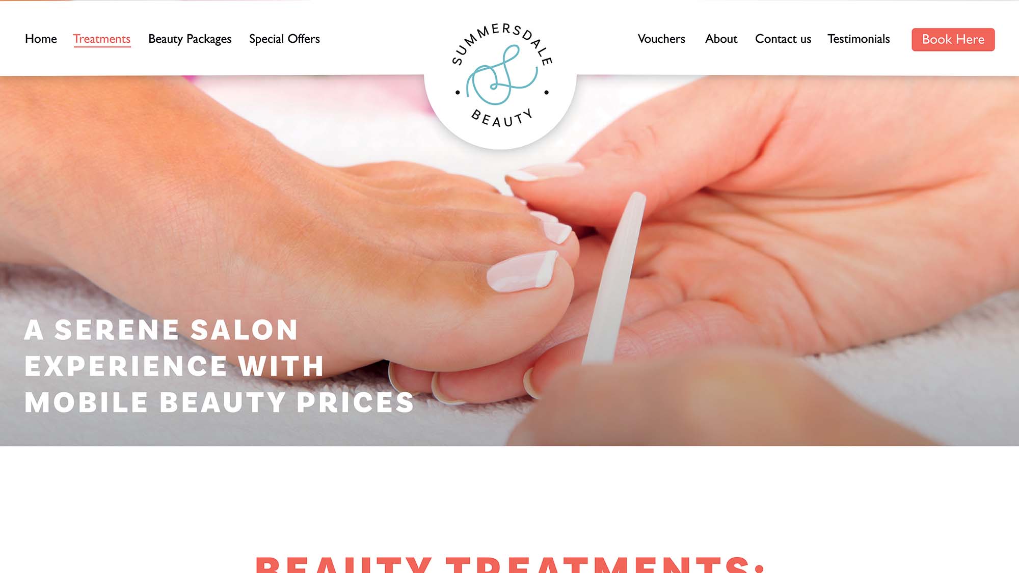
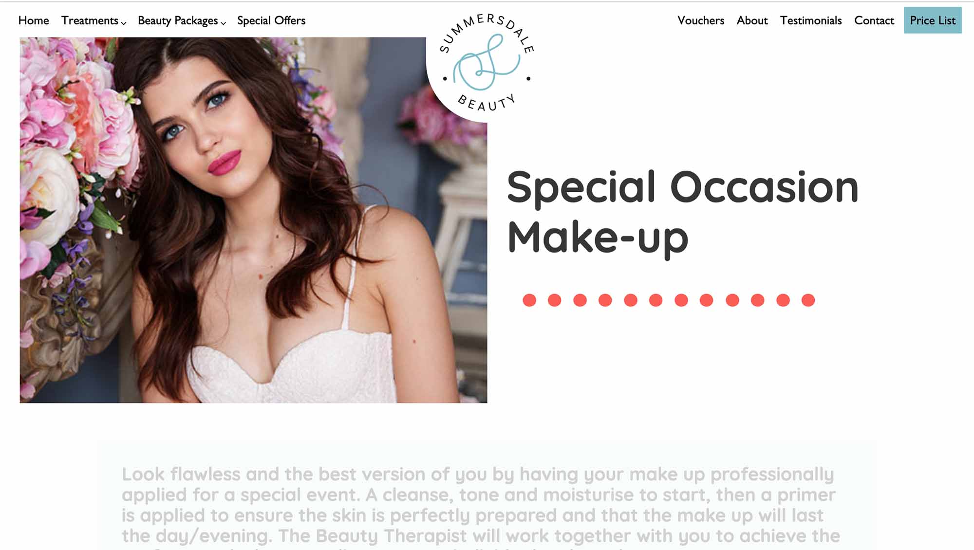
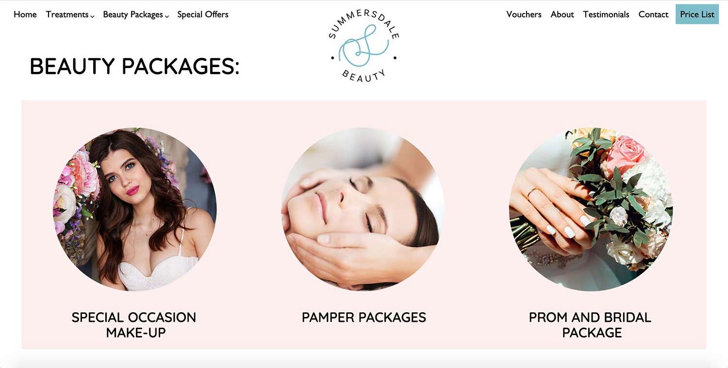
This was a branding and web design project for a beauty therapist. The logo was designed in a letterform style, combining the ‘S’ and ‘B’ of Summersdale Beauty into a versatile script emblem. A bright palette of blues, pinks and oranges were chosen to provide a recognisable house style and be used to separate sections of the website clearly. A rounded sans serif retained a friendly and approachable voice across the website.
