

CRJSP
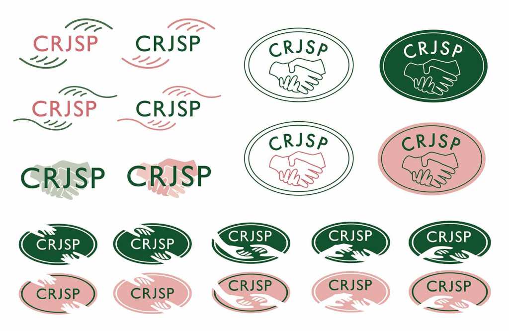
This client requested a logo to represent their school PTA for use in parents newsletters, advertising and at school events. It was important the logo incorporated the house style of the school, using their recognisable green palette. In the design stage, a pale peach was experimented with to compliment the green and provide more variation in the design. The aim of the design was to embody partnership, with this explored with the use of meeting hands. A detailed hand holding pose was chosen for the main image in a white outline to portray this theme. An illustrated mock-up of a summer fair poster was designed to present the logo in use.
